Most of us can easily recognize the majority of car emblems and badges existing today and some of you can even talk about performances and all kinds of technical specifications for the latest models, but very few actually know the meaning behind these car names and badges. You might think they were randomly chosen at the time, but more often than not they involve tradition, folklore, and some, even mystery.
We were curious to find out more about the world’s most famous car emblems and their meaning, so we went on to do a bit of research of all the major automotive names, emblems and brands to find out where they come from and what they really mean.
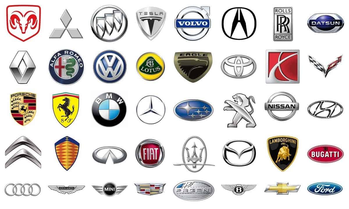
So here are 25 car emblems and their meaning (in alphabetical order):
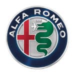
25. Alfa Romeo
The well known Italian car brand Alfa Romeo has adopted a quite dramatic emblem, full of its country’s tradition. The original emblem, designed by Italian draughtsman Romano Catteneo, uses Milanese features like the Biscione – on the right side of the emblem – signifying the house of Visconti which were the Milanese rulers in the 14th century. On the left side, there’s the Milanese red cross on a white background.
The badge was changed back in 1918 to include the dark blue ring that surrounds the emblem, on which the words ‘Alfa-Romeo Milano’ appear along the two Savoy dynasty knots for the kingdom of Italy. The year 1925 brought further changes, which meant the addition of laurels signifying Alfa P2’s win at the Automobile World Championship. In 1945, after Italy’s monarchy ended, the Savoy knots were removed.
The most controversial part of Alfa Romeo’s emblem, one that the company doesn’t talk much about, is the crowned serpent swallowing a man. The symbol apparently refers to the Crusades, where the Christians defeated the Moors, but the silence and mystery surrounding it leave us bewildered.
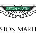
24. Aston Martin
The iconic British automaker Aston Martin, founded by Lionel Martin and Robert Bamford back in 1913, is one of the most well known sports car brands in the world and it’s got an emblem that rises to the brand’s fame. The founders were initially selling Singer cars in their Bamford & Martin shop before having the idea of producing their own automobiles.
A few years later, their name changed into Aston Martin Motors, a combination between Martin’s name and the Aston Clinton Hillclimb in Buckinghamshire, where Lionel Martin used to have fun driving now and then.
The Aston Martin logo, has evolved across time but kept the same underlying motif, the wings – and the speed they denote. Initially a simple superimposed A and M letters in a circle, it evolved into a V shaped winged logo in 1927 and into the modern version in 1987. Today, its straight wings and the Aston Martin name right in the front and center make it one of the most elegant car brand emblems of these days.
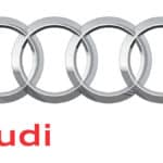
23. Audi
Audi and its four silver rings. In spite of what others might tell you, they’ve got no connection with the Olympic Games, even if they truly believe in it. The real meaning of Audi’s emblem comes from the 1932 unification of the four oldest German car manufacturers, Audi, DKW, Horch and Wanderer, forming what became known as the Auto Union. Automakers in the union were allowed to use the four silver rings as a logo, while the others had to use their own.
When 1985 came, the name Audi permanently took the place of the Auto Union. Audi, Latin derivative of (August) Horch, the founder of the original union, carried on making cars in the same German spirit that characterized the old brands. The emblem went through some minor changes across the time, so today it looks almost the same as it looked in the past.
Some would say that the Audi logo resembles the four wheel drive of the more modern Quatro, but although it makes sense, it has no connection.
22. Bentley
One of the most famous car names out there, Bentley, leaves a strong and powerful impression both through the name itself and the emblem it chose to represent it, a bold capital B surrounded by backward spread wings. The B comes from Walter Owen Bentley, the company’s founder, and the wings from the original name of the company, Bentley Aero, as it first manufactured rotary engines for World War I planes.
21. BMW
Though very common all over the world, BMW has stirred a little bit of controversy about the meaning of its emblem. Some claim that it comes from a propeller against the blue sky, referring to the early times when BMW was manufacturing airplane engines.
The real meaning for BMW is in fact Bayerische Motoren Werke AG (Bavarian Motor Works). The company was renamed from Rapp Motorenwerke in 1928 and the initial emblem had the BMW inscription inside a black exterior circle. The blue and white panels were added later inside a central circle and represent the Bavarian flag. Today, the BMW emblem is almost the same as the past one, with a few minor changes of font and font color.
20. Bugatti
Bugatti, one of the most powerful names in the auto world, has an elegant emblem which simply and elegantly represents its founder’s name initials, Ettore Bugatti.
The company, which actually died with Ettore back in 1947 because he had no successor, was revived by Volkswagen and continued to carry its name and emblem further into the future. Today, it’s one of the most fascinating automakers in the world. Bugatti cars are very few in numbers, but they’re extremely exclusive.
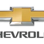
19. Chevrolet
With a name not as big as the other ones on this list, Chevrolet wins through the mystery of its logo’s origins, the iconic bowtie. There are several stories as to where it comes from and what it stands for.
One of them tells about a repeating pattern on the wallpaper of a French hotel room in which the co-founder of General Motors and Chevrolet, William C. Durant, was staying at some point. Another one, based on his wife’s claim, says that he was actually inspired by a newspaper ad for Coalettes which had the same bowtie outline. Several other stories about Louis Chevrolet designing the bowtie as a modified Swiss cross to honor his parents’ homeland sustain the bowtie story, which stuck throughout time.
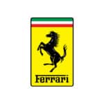
18. Ferrari
One of the most prolific automakers in the world, Ferrari, had to have an emblem to match their legendary cars. The ‘Prancing Horse’ (Cavallino Rampante in Italian) is the iconic car maker’s logo.
Its history goes back to Enzo Ferrari’s first victory at the Savio circuit, where he met Count and Countess Enrico and Paolina Baracca. Their son, who had passed away, was a fighter pilot who had a prancing horse emblazoned on his plane. Enzo Ferrari was told that the symbol would bring him luck, so the prancing horse was adopted. It was afterwards set on a yellow background to represent Ferrari’s factory in the town of Modena.
At first, since Ferrari cars were technically owned by Alfa Romeo, the emblem was only used in written publications and papers. It came on the cars for the first time in the summer of 1932 at the Spa 24 Hours. Later on, in 1963, the emblem was renewed to show today’s relief version of the ‘Prancing Horse’.
17. Ford
Ford Motor Company got its Blue Oval back in 1927. Since then, the recognizable Ford emblem hasn’t gone through too many changes. Initially, the emblem was overcrowded with the script ‘Ford Motor Co. Detroit’ on a black and white background. Years later, only the name Ford stuck and the badge got its Blue Oval.
16. Honda
Honda’s silver ‘H’ emblem might not look very special in any way, but its elegance and simplicity speak about the brand’s philosophy. The H comes from Soichiro Honda, the founder, who used to be a mechanic, tuner and racer with his biggest dream to own an auto factory. He managed to do that by transforming Honda into the largest builder of motorcycles and the second largest builder of autos in Japan.
The company is known for its mass market engines to be direct derivations of the racing versions, thus giving them an unmatched quality and reliability, in tune with what the bold logo speaks about.
15. Hyundai
While the South Korean automaker Hyundai’s emblem appears as just a copied and modified version of the Honda logo, it means a little more. The leaned ‘H’ from Hyundai represents both the brand name and two people shaking hands. The oval around it adds a symbolic perpetuity that Hyundai pursues in its business.
14. Infiniti
If you didn’t know yet, Infiniti is Nissan’s luxury auto brand. Its logo is simple but original, with an interesting meaning. There’s a partial oval surrounding a road that loses itself into the distance… or maybe into infinity. The badge is similar with the one of the Oldsmobile, which shows a road spanning into the distance and finally veering to the right.
13. Jaguar
Jaguar is a powerful car brand and the logo conveys that as well. There’s nothing mysterious about the badge, which first had letters ‘SS’ in a hexagon on top of an eagle’s wings and tail, referring to the SS Jaguar produced by the Shallow Sidecar Company back in 1935.
A decade later, the Jaguar cat made its first apparition on the company’s emblem, conveying power and agility without any other hidden meanings. Their cars have already proven those qualities to the entire world.
12. Lamborghini
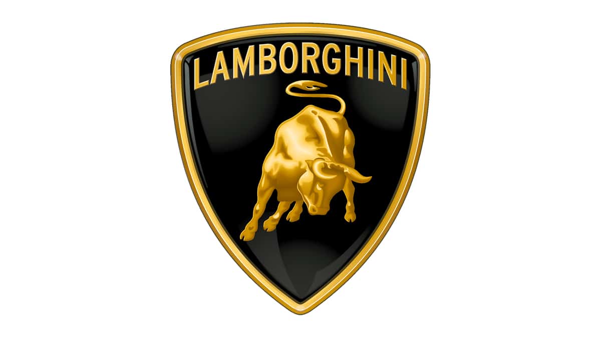
With a history going back to 1962, when the company founder Ferruccio Lamborghini visited Don Eduardo Miura’s ranch of fighting bulls. The animals left a very strong impression on Lamborghini, so he adopted the bull as the emblem for his cars.
What’s more, he also started using names and terms from the fighting bulls’ world for his car models, except Miura, which was the name of the breeder he met at the ranch. All the other, Aventador, Diablo, Gallardo, Murcielago, Urraco, Islero, Jalpa, Espada are a match to the bull emblem. Out of them all, only Countach doesn’t seem to have any connection with the bullfighting world.
11. Lexus
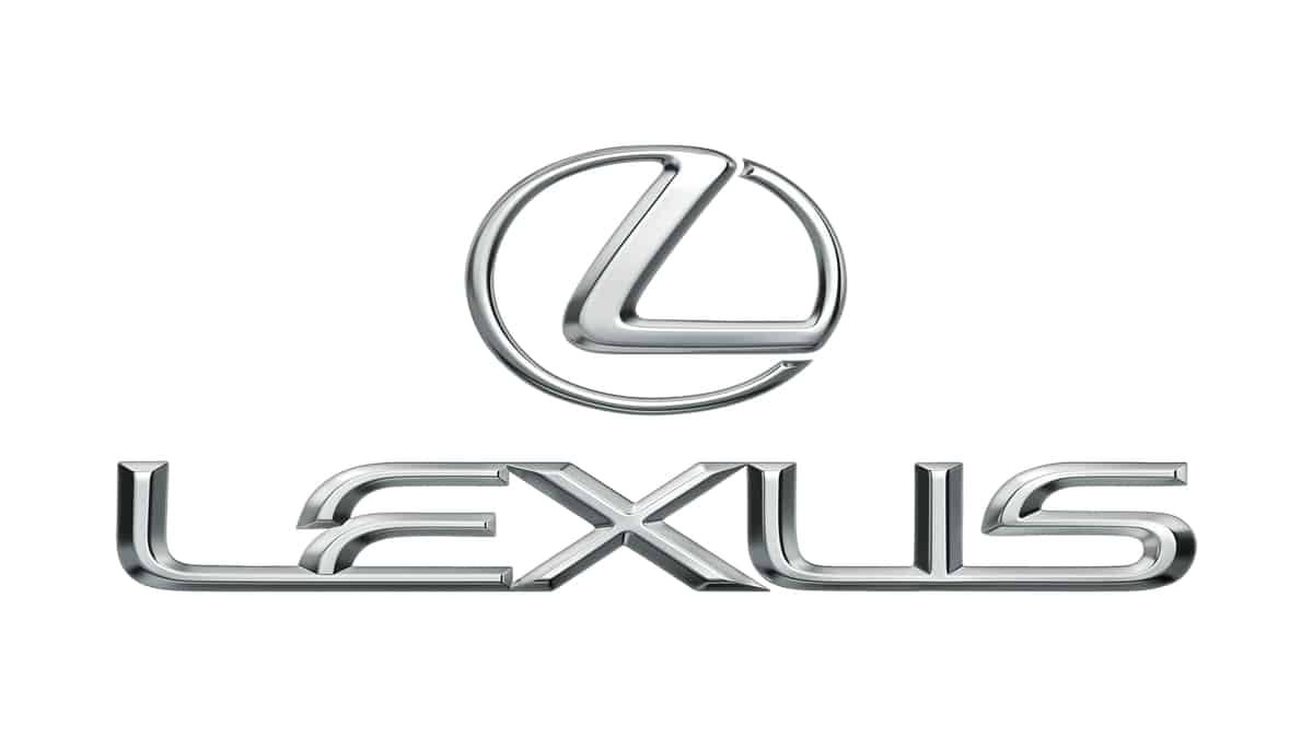
Lexus is a luxury brand made by Toyota and made its apparition only in 1989. Due to the little history behind, the brand’s emblem hasn’t got a very deep or elaborate meaning.
It’s simple and comes from the name Alexis, the original name they planned to give the cars. The name further became A Lexus, and finally Lexus stuck. There are some stories going around that Lexus stands for ‘Luxury Exports to the US’, but while it’s a fun claim, it’s not true at all.
10. Lotus
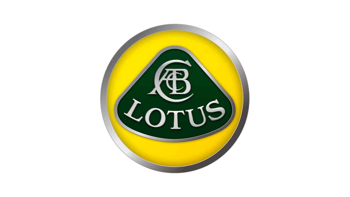
The British car maker Lotus, founded by Anthony Colin Bruce Chapman, has had its emblem since 1952, when the company Lotus Engineering Ltd. was founded. Though the origins of the name are unknown, the logo borrows that period’s popular British Racing Green (BRG) in the background, surrounded by a yellow thought to come from the sunny perspective of Chapman for his cars’ future.
After seeing success in the world of Formula 1, the company got through some struggles in the 70s and the early 80s, only to be rescued by the sale of the famous Lotus Esprit Turbo on the North American market. Though Chapman passed away in 1954, his company lived on to see the better future envisioned. Today, Lotus produces some of the best cars in the world.
9. Maserati
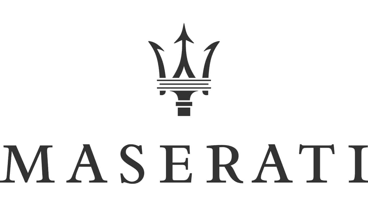
Since its inception back in 1926 with the Tipo 26, Maserati has kept its Trident logo almost unchanged. It drew inspiration from the iconic statue of Neptune, the god of the sea, from the Piazza Maggiore in Bologna, Italy, where the first headquarters of the company were situated. Neptune is shown wielding his legendary trident scepter.
Added to the Maserati logo are the colors red and blue, which represent Bologna.
8. Mazda
Mazda first got its logo back in 1936 when it was a triple stacked M resembling the initials of Mazda Motor Manufacturer. Part of the inspiration came from Hiroshima’s emblem, which was the company hometown. Apart from the M’s, there were a pair of wings symbolizing ‘agility, speed and the ability to soar to new heights’.
When Mazda got to manufacturing commercial vehicles in 1959, its logo received a new shape, the letter ‘M’ in the center of a circle. The emblem got through several other iterations across the years before establishing the logo that you see today. The last variant, adopted in 1997, shows an ‘M’ and a ‘V’ shape in an oval, with a pair of wings turned up, reminding of the company’s desire to soar to the new heights.
7. Mercedes-Benz
The famed Mercedes-Benz, part of the larger Daimler-Motoren-Gesellschaft (DMG), got its iconic three-pointed star logo back in 1909. After DMG founder – Gottlieb Daimler – passed away in 1900, his sons, in search for a logo for the brand, turned to the star symbol of their father’s home, which represented future prosperity for the company.
The three-pointed star logo was well received, but it was not the only one. The board at Daimler registered a four-pointed star as a second trademark as well. Across time, only the three-pointed star version survived, apparently representing Daimler’s goal to power air, land and sea vehicles alike. The logo received only minor changes. In 1916 it received the circle around the star, and finally ended up with today’s silver star inside a silver circle.
6. Nissan
The simple ‘NISSAN’ emblem that you see today, though it doesn’t betray much, began many years ago and started from the iconic ‘Rising Sun’ symbol of Japan.
It all began when Nissan acquired the control of the old Datsun – or DAT Motors, which used as a logo their name in a blue rectangle over a red circle – the ‘Rising Sun’ of Japan’s national flag.
The actual logo of the brand Nissan took shape in 2001 and is a modern interpretation of Datsun’s original logo. They utilize chrome, which conveys the modernity, creativity and sophistication.
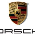
5. Porsche
We have to admit that the Porsche emblem is one of the most attractive of all car emblems ever created. The Porsche crest in gold, black and red is also one that stood the test of time since it was created back in 1952 by Ferdinand Porsche.
The emblem clearly reminds of the city of Stuttgart, where the company has its headquarters. The horse is connected to the city’s origins, a stud farm. The antlers and the red and black stripes represent the old Kingdom of Württemberg, which used to be a state in the Federal Republic of Germany.
As the brand’s amazing legacy, the Porsche logo remained unchanged across time.
4. Subaru
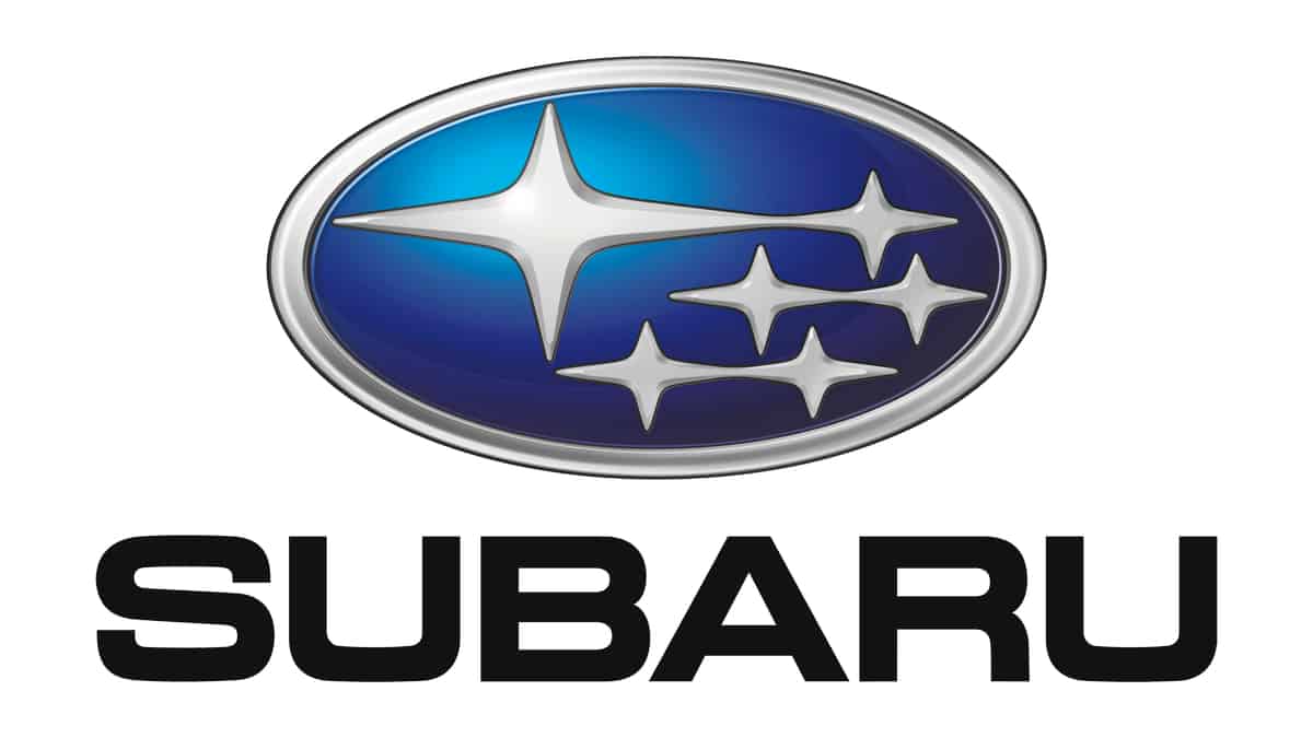
Subaru doesn’t say much at first, but it’s really an emblem loaded with meaning. The name itself means ‘The Pleiades’ in Japanese, which point to the star cluster in the Taurus Constellation.
The emblem used on their cars shows the six most visible of these stars to the naked eye (Electra, Maia, Taygete, Asterope, Celaene and Alcyone). The stars also bear meaning for the company. They represent the 1953 merging of five companies into a large one, with the five stars representing the merged companies, and the big star obviously the large resulting company.
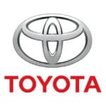
3. Toyota
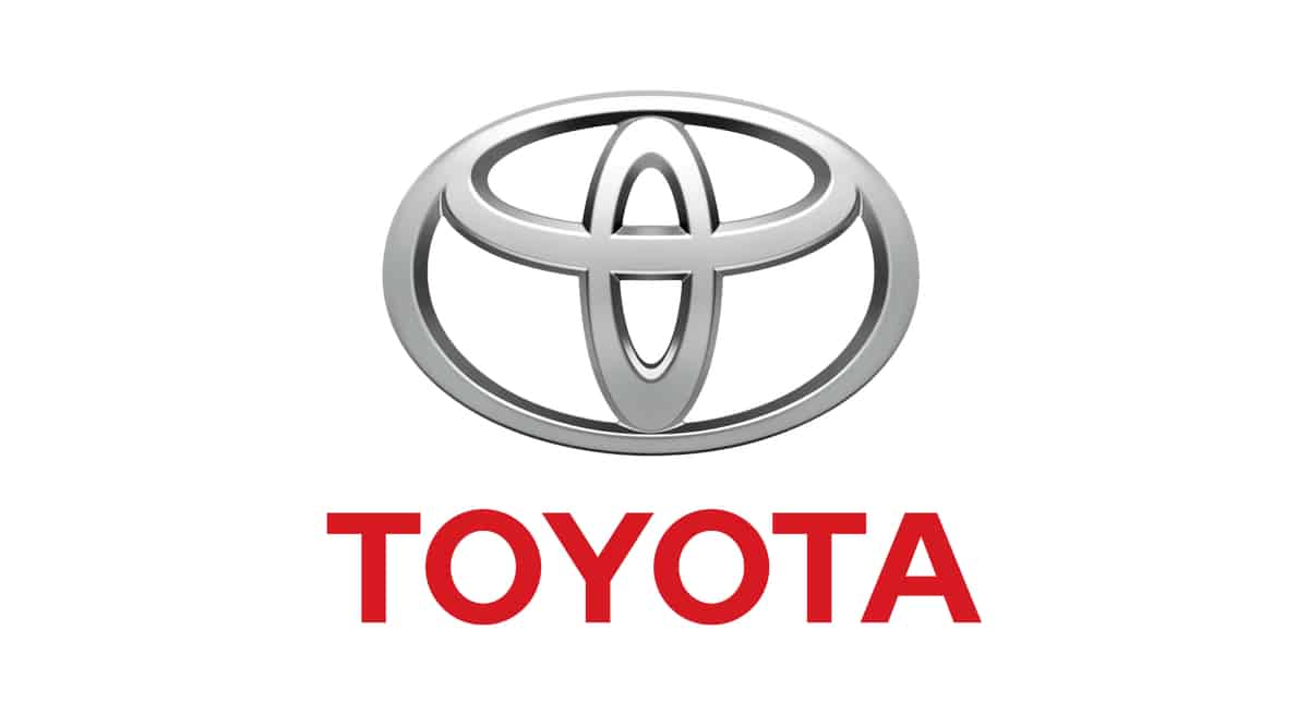
Some say Toyota’s emblem has an artistic sense, others that it’s a bloated interpretation of the letter ‘T’, but it actually goes a lot deeper than that with the meaning. The ovals that overlap each other symbolize the trust between Toyota and its customers.
The white space around the ‘T’ is seen as the future potential of the company. The other three ovals apparently depict the collective hearts of the customers, the cars and the technological opportunities that lie in the future.
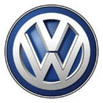
2. Volkswagen
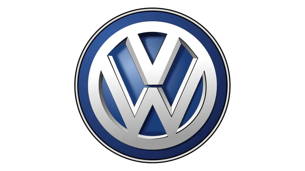
Volkswagen is one of the largest and most known car manufacturers in the world which is somehow in tune with its emblem. Simple, wrapped in a circle, the ‘V’ and the ‘W’ convey a lot of meaning.
The first letter stands for ‘volks’ (German for people), with the ‘W’ meaning ‘wagen’ (cars). The ‘V’ stacked on top of the ‘W’ also conveys the idea that people ride on the cars, which makes sense. It’s simple, probably one of the simplest logo’s in the auto world, yet iconic.
1. Volvo
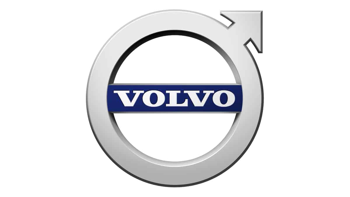
Despite what many would think given the car’s origins, the name Volvo isn’t Swedish at all. It sprung from the Latin word ‘Volvere’ which means ‘roll’. Volvo thus means ‘I roll’. Couldn’t have been a better fit for a car company name.
The original emblem of the brand, adopted in 1927, came with a blue oval with the Volvo name in the center and Gothenburg, Sweden – the brand’s headquarters – on a banner beneath the name. When 1930 came, Volvo adopted the symbol that you see today, the iron alchemy/Greek male/Mars, god of war symbol.
The company took only the first association as their symbol, conveying strength, protection and innovation. Just several years ago, they simplified their badge by moving their name completely inside the circle. The Volvo emblem still keeps its widely recognizable symbols even after they’ve been acquired by the Geely of China.
Video