Visual identity is important. Today it’s definitely more important than ever, due to the evolution of communication technology, which allows spreading the information further and faster than ever before, making brands and individuals compete not locally, but globally. And if a brand can’t distinguish itself among the myriad other similar brands, the battle is already lost.
It’s a known fact already that an average person is exposed to more than 5,000 brand logos on an average day. And 5,000 is a big number. Now imagine what it means to have a striking visual identity as to make that person remember you between all the other brands. Doesn’t sound that easy, does it? Logos are important and that’s why big brands spend big bucks on designing the perfect logo, one that will stick with people.
And there are quite a few brand logos that have stood the test of time and that almost anyone no matter where they are in the world, can easily recognize. Think Google, or McDonalds or Coca Cola. Everyone knows them. But they’re not the only brands with immensely famous logo, so let’s take a look at the most iconic logos ever created.
We’ve picked up 20 of the most famous logos of all time. Here they are:
20. Rolex
![]()
Rolex, the famous watch brand that the entire planet has heard of, has a logo of a pointed crown above the name of the company. The symbol leads you thinking of prestige, perfectionism and victory. Introduced back in 1908, it hasn’t received many changes along the time and still represents the company’s slogan, ‘A Crown for Every Achievement’.
19. MTV
![]()
When it appeared back in 1981, MTV was a big success. Their famous old logo, the ‘M’ block with the scrolled ‘tv’ only changed recently, in 2009, when the ‘M’ received different images and the ‘tv’ became white.
18. NASA
![]()
They’re not selling you the next Coca Cola, but they’re still old and famous. NASA, founded back in 1958 as the National Advisory Committee on Aeronautics, comes with not one, but three recognizable logos. The NASA insignia, the NASA logotype and the NASA seal, with the latter being originally approved by President Eisenhower and later modified by President Kennedy. Coca Cola never had that honor.
17. Colgate
![]()
With its red and white colors, Colgate enjoyed world-wide fame. And it’s no wonder that happened, when the color red symbolizes dynamism and the color white reminds us of sincerity. Is it really because of those colors that we have widely accepted Colgate as our main toothpaste? Well, there has to be a little bit of truth in that, doesn’t it?
16. McDonalds
![]()
McDonalds represents today the most known fast food chain in the world. Hell, they even measure the cost of living in various countries and cities by the prices they’ve got at McDonalds. With their huge golden arches, McDonalds are spotted from miles away between all the other brands and draw more than sixty million people every day.
15. Hewlett Packard
![]()
While Hewlett Packard might be too long for some people to remember it, almost everyone knows of HP. The blue and white colors of their logo, symbolizing excellence and the tails of the H and P, speaking of innovation, make HP one of the most successful logos of all time.
14. Honda
![]()
Honda, with its bold ‘H’ logo talks about its legendary durability and conveys confidence into the machines they create. The name of the company comes from its founder Soichiro Honda, and the logo uses the original ‘H’ since its very inception. Just like a good old Honda that still runs fine even after several decades.
13. GAP
![]()
GAP was created back in 1969, with its original logo comprised of the words ‘the gap’ written in simple text. The logo was changed in 1984 with the blue box, and in 2010, they had an unsuccessful attempt to change it into something sexier. Unsuccessful because customers opposed the change on social media, so the company had to switch back to the old one. Well, at least they know people love it.
12. UPS
![]()
United Parcel Service, or better known as UPS, have been delivering packages for more than a century. There are fifteen million packages delivered in 220 countries on any give day. Or that’s what they say. The UPS logo got through four iterations across the time. The first three had the UPS letters encased in a shield. In 2003, the company decided to go for a rebranding and they also changed the logo.
11. Disney
![]()
Walt Disney and his legendary creation are probably in the minds of all kids on Earth. And their parents. For different reasons. But the thing is they all remember the Disney logo, which is the actual signature of its founder, Walt Disney. It’s been everywhere for decades and it doesn’t show signs of being forgotten anytime soon.
10. Starbucks
![]()
Since their opening back in 1971, Starbucks came with an interesting and alluring logo. It was a mermaid that the founders have seen fit to lure their clients with, in the same way the legendary mermaids were luring sailors to crash their ships into the coast of an island in the South Pacific, known as Starbuck Island.
The original mermaid with the crown underwent several revisions across the years, the most important being the one in 1987, when designer Terry Heckler cleaned up a bit the complicated original logo. The last revision, in 2011, removed the circle around the mermaid and the background was changed from black to green.
9. 3M
![]()
Minnesota Mining and Manufacturing Company has probably one of the most simple logos ever created. It’s comprised of two simple red characters in a sans serif font and while it now seems so damn easy to create, the logo actually got through several revisions since its inception in 1906, each time getting simpler and simpler.
8. FedEx
![]()
You might not consciously know it, but it’s there. The arrow pointed from left to right conveying the service of delivery and its speed. FedEx is one of the best examples of subliminal advertising in its logo. The arrow is intelligently hidden in the white space between the E and the X.
7. eBay
![]()
eBay’s new logo was replaced in 2012 and conveys a lot of energy through the use of lively colors and design elements like zigzag letters (known as baseline shift in the designer’s jargon). Their initial logo was created in 1997, when the company changed their name from ‘Auction Web’ to eBay.
6. Pepsi
![]()
Founded in 1893 by Caleb Bradham, Pepsi Cola is one of the most famous brands in the world. Well, today it’s only Pepsi, but their logo and name are known all over the world. Their logo design, first created in 1898, remained the same until 1962 when the company dropped the name ‘Cola’ and only kept Pepsi. The logo got reviewed five more times between 1971 and 2005, with each evolution becoming better and better.
5. Microsoft
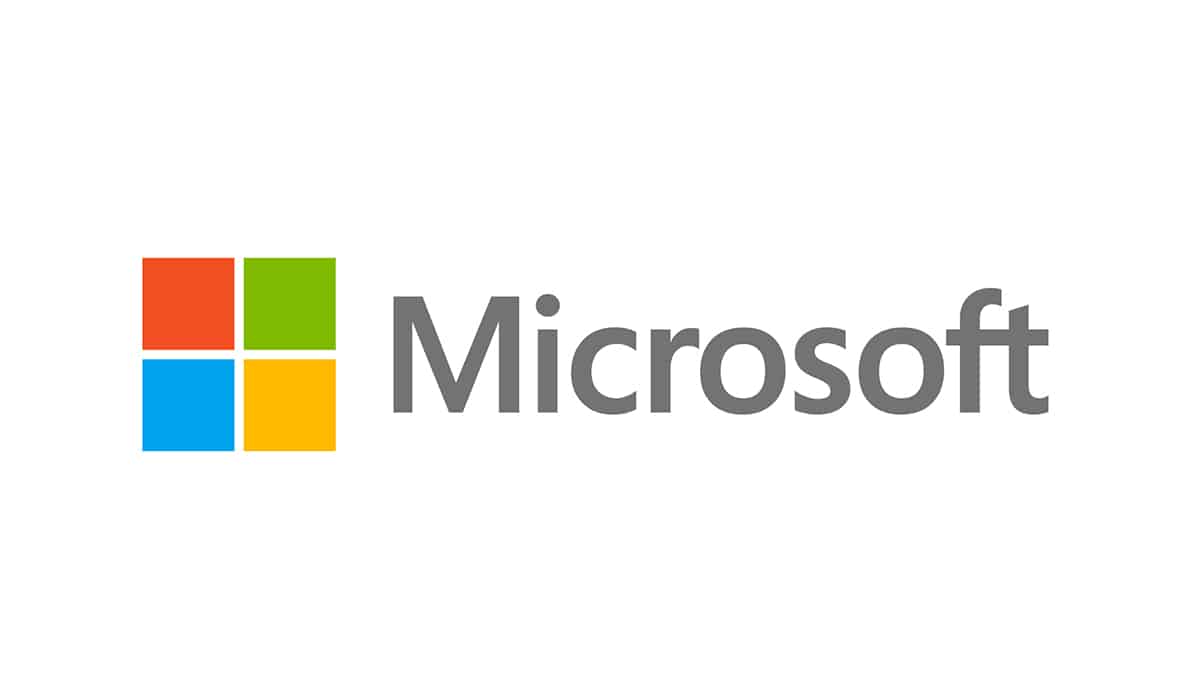
Microsoft’s logo encompasses the four main components of the company. One is the Windows operating system as the blue square, the red is the Office, green for Xbox and yellow for Surface. Smart, isn’t it?
4. Apple
![]()
While there are many stories going around about Apple logo’s symbolism, the real one is very simple. A simple apple would have looked more like a cherry, so for scaling purposes, the bite was added. Today, everyone knows clearly it’s an Apple.
3. Google
![]()
With millions of people surfing the internet every day, Google is omnipresent. Their logo is the main piece of the website and reflects the fun side for which the company is known. With more than 100 billion visits per month, Google’s reach is immense. It’s literally everywhere.
2. Coca Cola
![]()
The iconic Coca Cola was created back in 1886 by John Pemberton and its logo was actually created by his bookkeeper. Simple, formal handwriting, it was called a Spencerian script at that time. The logo received a slight redesign in 1890 and included swirls and cherries hanging from the C’s, but didn’t last much. The original logo stayed and became on of the most recognizable brand images in the entire world.
1. Nike
![]()
While Nike was born in 1964, their now iconic ‘swoosh’ log was created several years later, in 1971. Until then, the company wore the name ‘Blue Ribbon Sports’, but after a name change into Nike – after the Greek goddess of victory, it also got its logo.
The ‘swoosh’, created by designer Carolyn Davidson, conveys speed and movement and it’s one of the most recognizable brand logos of all time. While the logo brought a lot of money to the company during the years, Davidson, the designer, received a mere $35 dollars for her work back then.